The designer of Helado i Ice Cream packaging has not limited her project to the impact of a single logo, rather opting for a visual merchandizing technique that incorporates a playful range of different typography. The name of the dessert brand is strapped across the top of these plastic pouches in bold and bubbly text, but the same words are repeated over the entire surface of each wrapper, scrawled in styles from serious and sophisticated to sweet and youthful.
To accompany the letters that cover almost every inch of the snack packs are endearing little illustrations of ice cream cones, popsicles, peppermints, strawberries and swirls. Sealed within Helado i Ice Cream packaging by Milena Soto, the three flavors of Coronado treats appeal with an image of whimsical nostalgia.
Why This Trend Is Growing
- Visual Merchandising
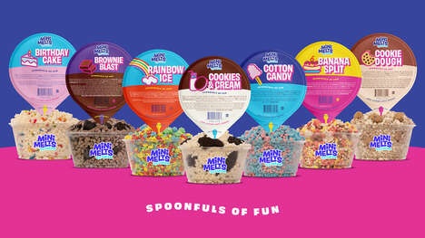
- Exploring creative and visually engaging packaging designs for products can create a strong brand identity and appeal to consumers.
- Typography Trends
- Incorporating different typography styles in packaging design can add visual interest and uniqueness to a brand.
- Nostalgia Marketing
- Using nostalgic imagery in packaging design can evoke positive emotions and create a connection with consumers.
Industries Being Reshaped
- Food Packaging
- Innovative packaging designs can disrupt the food packaging industry by enhancing product appeal and increasing consumer engagement.
- Graphic Design
- Adopting diverse typography styles in graphic design can provide opportunities for designers to create visually striking and memorable brands.
- Dessert Industry
- Integrating playful and nostalgic elements in dessert packaging can differentiate products and attract nostalgic consumers.