M&A Creative Agency Created a Luxuriously Styled Bottle for This Brand
Riley von Niessen — September 7, 2016 — Lifestyle
References: creative.grupoma.eu & fubiz.net
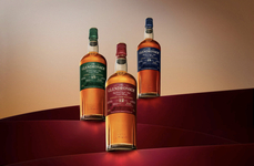
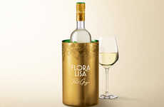
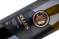
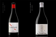
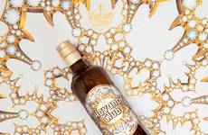
In order to make Convento da Glória's quality of product more evident to consumers, M&A Creative Agency worked to design a gold-embossed label to go over its bottles.
A total of three different labels were made by the creative communications agency, with each working to connote the unique sense of taste each of the Portuguese wine brand's flavors carry. M&A Creative Agency does this by using a variety of colors, with a deep chocolate brown covering the background on one label, whereas others sport a rich turquoise and a rosy beige hue.
The gold-embossed features remain the same on the latter two, however the 'Reserva' label includes it a bit more minimally. The typography used by M&A Creative Agency does much the same as the patterns featured on the gold-embossed label -- all of which aim to make clear Convento da Glória's expansive history and its constant strive towards excellence.
Trend Themes
-
Luxury Packaging — The use of gold-embossed labels on wine bottles highlights the trend of luxury packaging, appealing to consumers seeking premium experiences.
-
Customized Branding — Creating multiple labels with unique colors and typography showcases the trend of customized branding, allowing brands to convey different messages and target specific consumer preferences.
-
Heritage Marketing — By emphasizing the expansive history and constant strive towards excellence, the gold-embossed wine branding taps into the trend of heritage marketing, connecting with consumers who appreciate tradition and authenticity.
Industry Implications
-
Wine and Spirits — The wine and spirits industry can leverage luxury packaging and customized branding to elevate their products and create a premium brand perception.
-
Creative Communications — The creative communications industry can explore opportunities in designing personalized and visually appealing packaging solutions to enhance brand value for clients.
-
Marketing and Advertising — Marketing and advertising professionals can tap into the trend of heritage marketing, helping brands showcase their history and commitment to excellence through effective storytelling and branding strategies.
3.2
Score
Popularity
Activity
Freshness
