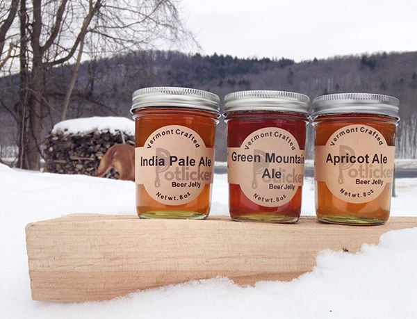
The creator of Fatworks oil packaging hoped to do away with the heavy image of traditional fat products, in favor of a scheme that exuded lightness and simplicity. A pair of techniques was employed by Sol Garcia to make these scrumptious products more enticing in their plain states. This method concerns the container and the label.
The transparent vessels were left without stickers -- a choice that keeps the cooking oils from looking too cluttered. Minimal text was applied to describe the products and to mark them with their brand name. The decision to use jam jars was a thoughtful one too. Fatworks oil packaging might remind you of your own domestic practice of emptying grease and lard into reused glass containers. This idea communicates a sense of trusted home-cooked quality.
Key Themes Behind This Trend
- Minimal Packaging
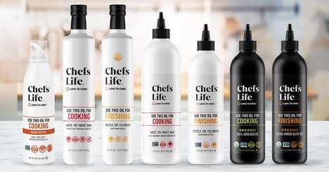
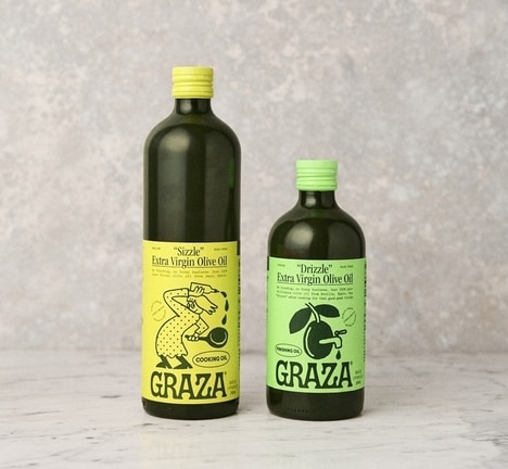
- The use of transparent containers and minimal labeling reduces clutter and creates a sense of simplicity and lightness in product packaging.
- Simplified Typography
- Minimal text is applied to describe products, allowing for a clean and uncluttered design that focuses on the brand name.
- Nostalgic Design
- Using jam jars for oil packaging evokes a sense of trusted home-cooked quality, appealing to consumers' desire for familiar and comforting products.
Where This Applies
- Food Packaging
- Food manufacturers can explore minimal packaging techniques to create a sense of simplicity and quality in their products, attracting health-conscious and design-savvy consumers.
- Branding and Marketing
- Brands can take inspiration from simplified typography to create minimalist and memorable product labels that stand out in a crowded market.
- Sustainable Packaging
- Utilizing reusable glass containers for packaging can effectively communicate an eco-friendly approach and appeal to consumers who prioritize sustainability.