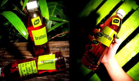

The 'Rise and Shine' energy drink packaging is designed after lightbulbs, taking the idea of energy and power quite literally.
Remark Studio noticed "a lack of innovation in packaging and also in material and shaped used for energy drinks." So this design studio sought to create a memorable premium energy drink with a catchy name and bottle. The design manages to fit all of these parameters quite well. The name and packaging of the energy drink are synonymous with electricity.
Remark Studio's concept includes other details like that the packaging should be a bright white when it is removed from the fridge and then gradually fade to a duller color as it is consumed. This is a novel product that is certainly memorable, especially since it would set itself apart from many other types of energy drink packaging.
What Makes This Trend Stand Out
- Innovative Packaging
- The Rise and Shine energy drink packaging demonstrates a unique and creative approach to packaging design, providing opportunities for disruptive innovation in the packaging industry.
- Sensory Packaging
- The gradual color change of the Rise and Shine energy drink bottle presents the possibility for disruptive innovation in sensory packaging, allowing for a more engaging and immersive consumer experience.
- Brand Storytelling
- The Rise and Shine energy drink name and packaging's connection to electricity offers potential for disruptive innovation in brand storytelling, allowing companies to create memorable and unique narratives around their products.
Sectors Adopting This
- Beverage Packaging
- The Rise and Shine energy drink packaging showcases an innovative approach to beverage packaging, creating opportunities for disruptive innovation in the industry.
- Energy Drink
- The Rise and Shine energy drink disrupts the energy drink industry by offering a unique and memorable packaging design that sets it apart from competitors.
- Design Studio
- Remark Studio's innovative concept for the Rise and Shine energy drink packaging demonstrates disruptive potential in the design industry, inspiring new approaches to product packaging and branding.