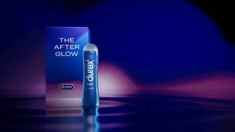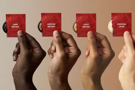
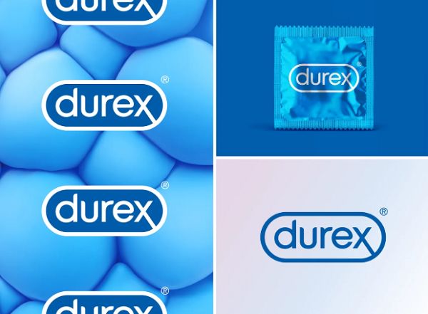
A new visual identity is designed for popular condom brand Durex by London-based creative agency Havas London and design agency Design Bridge.
The new aesthetic venture for Durex was motivated by the condom brand's 2017 Global Sex Survey, which revealed that “underlying sexual anxiousness” was the result of "unrealistic representations of sex." Through the brand refresh, Durex hopes to have a more inclusive presence and be able to stronger communicate authenticity and transparency to its consumer base.
Various brand aesthetics, including the logo, were addressed during the revamp. One of the more playful elements is the brand new custom typeface that was created by Colophon Foundry. It is titled 'One Night Sans.'
Havas London hopes that this condom brand revamp will "lead [to] healthier conversations and attitudes towards sex."
Image Credit: Havas London
What's Driving This Trend
- Sexual Wellness Brand Refresh
- Opportunity for design agencies to assist in sexual wellness brand refreshes to promote authenticity and inclusivity.
- Custom Typeface Design
- Opportunity for typeface designers to create custom fonts that embody the personality and message of brands.
- Inclusive Advertising Campaigns
- Opportunity for marketing and advertising professionals to promote inclusive and healthy attitudes towards sex through their campaigns.
Who This Affects Most
- Sexual Wellness Products
- Opportunity for sexual wellness products companies to invest in refreshing their brand identities to appeal to a wider range of customers.
- Graphic Design Agencies
- Opportunity for graphic design agencies to partner with sexual wellness companies to create unique and inclusive visual identities that promote authenticity.
- Marketing and Advertising
- Opportunity for marketing and advertising professionals to lead the way in promoting inclusive and healthy attitudes towards sex.