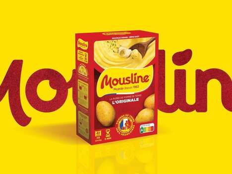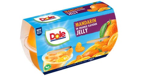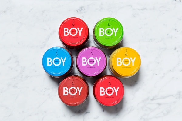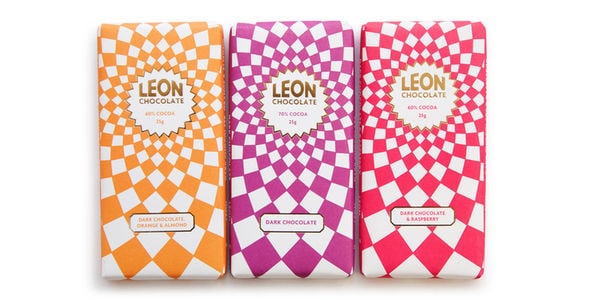
Comillas is a food brand that's been rebranded with a bit more of a colorful punch. The main hues used here are red and white, which is simple but works well with the brand.
Analogo is the company that was hired to do this rebranding, and they really managed to keep things simple while ensuring that the look was still noticeable. Sometimes less is more when it comes to branding, and that's exactly the approach Analogo took with Camillas. Interestingly, even certain products take on the same branded look as the business cards, which is great if this can be done with more than just one item!
The Comillas branding is minimalist yet vibrant in hue.
What's Driving This Trend
- Minimalist Branding
- Opportunity for businesses to create simple yet impactful branding strategies that stand out.
- Colorful Packaging
- Potential for brands to use vibrant hues in their packaging to attract consumer attention.
- Branded Product Extensions
- Opportunity for businesses to extend branding beyond traditional items and into product design.
Who This Affects Most
- Food Packaging
- Food brands can explore innovative packaging designs to enhance their market presence.
- Graphic Design
- Opportunity for graphic designers to create visually compelling brand identities.
- Retail
- Retailers can leverage unique branding strategies to differentiate themselves in the market.