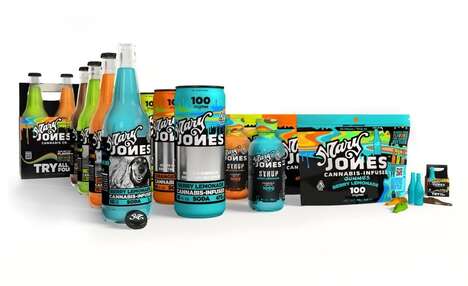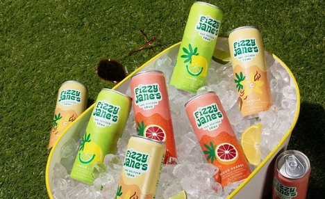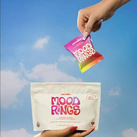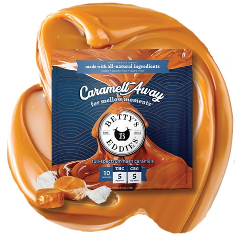

Cannabis company Jane worked with design firm Work By Honey to develop a name and persona to bring its vision to life, and in doing so, the cannabis company is challenging the way consumers perceive cannabis infused-edibles. With typographic details, the brand's product packaging helps to paint a picture of Jane, who's described as "never plain" and "your best friend’s best friend, the one that’s up for anything."
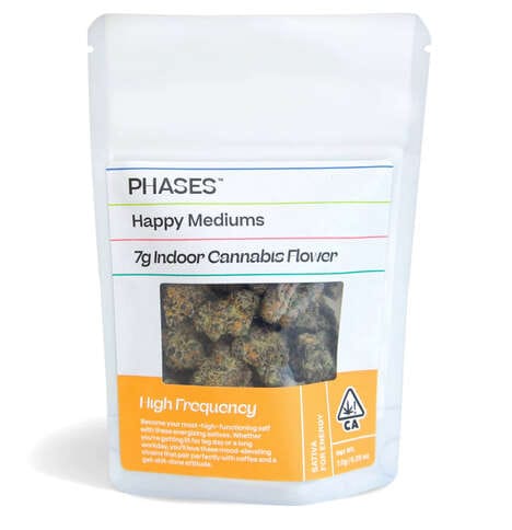
As recreational cannabis is new to many first-time users, Jane even includes a side panel that provides a description of what consumers can expect, detailing that each of its brownies contains five milligrams of THC, which could take a few hours to kick in and that users should pace themselves accordingly.
What's Driving This Trend
- Approachable Packaged Edibles
- 'Jane' is challenging consumer perceptions of cannabis-infused edibles with relatable and friendly packaging.
- Personified Branding
- Jane's typographic details and persona bring the brand to life, making it more relatable and appealing to consumers.
- Informative Packaging
- Jane's inclusion of detailed information about the product helps educate and guide first-time cannabis users.
Who This Affects Most
- Cannabis
- The cannabis industry can benefit from developing approachable and relatable packaging to attract new consumers.
- Design
- Design firms can provide innovative branding solutions by creating personified packaging that connects with consumers on a deeper level.
- Consumer Goods
- Companies in the consumer goods industry can learn from Jane's packaging strategy to provide informative and engaging product packaging that enhances the user experience.