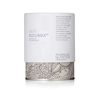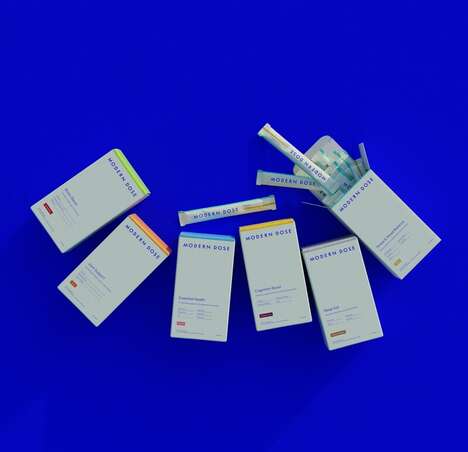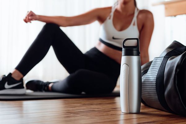
Robot Food has done something quite interesting with the redesign of Bulk Powders' look: it's taken inspiration from the minimalist packaging movement, and all the while, it's referencing the pill bottles and foil capsule packets that are typically seen at the pharmacy.
In making a reference to the way medication is wrapped up, the brand is likening its supplements to scientific formulas and the potency of drugs, sending a strong message to consumers that these products offer safely tested for guaranteed results. And so that people understand that they're however not being presented with a list of unpronounceable ingredients, Bulk Powders' bottles have been manufactured to be minimally labeled transparent bottles, expressing this notion of purity.
Finally, a bold reframing of the logo and the punchy integration of high contrasts and neon green make this line of protein powders really stand out.
What Makes This Trend Stand Out
- Minimalist Packaging Movement
- Opportunity for brands to adopt minimalist packaging in order to convey messages of purity and scientific formulas.
- Referencing Pharmaceuticals
- Brands can draw inspiration from pharmaceutical packaging to communicate the safety and guaranteed results of their products.
- Transparent Bottles
- The use of minimally labeled transparent bottles creates a sense of purity and transparency for consumers.
Sectors Adopting This
- Health Supplement
- Health supplement brands can leverage the trend of referencing pharmaceuticals to enhance the perceived effectiveness and safety of their products.
- Packaging Design
- The minimalist packaging movement presents an opportunity for packaging design agencies to create sleek and clean designs that communicate a sense of purity and quality.
- Fitness and Wellness
- Transparent bottles can be adopted by fitness and wellness brands to showcase the transparency of ingredients used and appeal to health-conscious consumers.