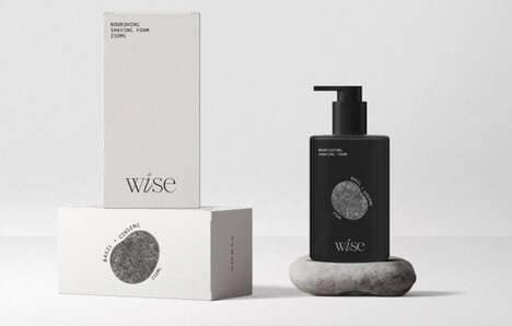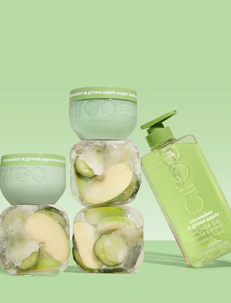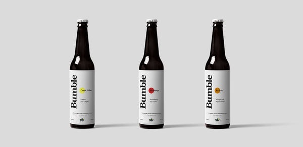
Russian agency 'BRANDEXPERT' created a new look for the Biotox Body Care brand's products. The fresh branding provides a fruit-themed display, which aims to project the brand's organic and natural ingredients.
Each product has been given a new look using bright colors and eye-catching images of fruits and floral arrangements. Additionally, each product has been adorned with the freshly redesigned Biotox logo. The logo now features the brand's name in all lowercase letters with the dot above the 'i' replaced with an illustrated leaf.
The idea for this re-branding is to boast the brand's floral, fruity and aromatic qualities. In order to allow the viewers to fully understand the product's natural and authentic ingredients, the design agency decided to put the fruit directly in front of each consumer's eye.
Key Themes Behind This Trend
- Organic Skincare
- Opportunity for brands to re-brand their skincare products with a focus on organic and natural ingredients.
- Bright Colors
- Using bright colors and eye-catching images on product packaging to attract consumers.
- Illustrated Logos
- Re-designing logos to incorporate illustrations that represent the brand's core qualities.
Where This Applies
- Beauty and Personal Care
- Re-branding skincare and beauty products with fruit-themed designs and organic ingredient focus.
- Graphic Design
- Opportunity for design agencies to collaborate with brands in re-branding their products with fresh and appealing designs.
- Packaging and Labeling
- Using innovative packaging designs with bright colors and fruit illustrations to stand out on store shelves.