Where Amè Honey packaging differs from your typical condiment container is in its very form. Some successful food producers might order specially sculpted vessels for their products; however, these tend to embody just subtly different silhouettes to competing brands, plus they rarely exude any specific reference to the nature of the contents. What Luca Calizzano did for Amè Miele was ingrain patterns directly into the surface of the otherwise standard-formed jam jar that would serve as a fingerprint for the vessel's original use.
A honeycomb motif was embossed around the top and the bottom of Amè Honey packaging to give it enticing organic detail. The printed logo was thus kept quite simple, leaving the brown and yellow pigments of the sweet spreads to show through. The visual scheme is all about the purity and the origins of the product.
Key Themes Behind This Trend
- Embossed Branding
- Embossing patterns onto product packaging can create a memorable, organic detail that enhances its appeal.
- Sculpted Vessels
- Using specially designed containers to package products can create unique brand recognition and differentiation.
- Simple Visual Scheme
- Simplistic and aesthetically pleasing designs can enhance the purity and origins of a product.
Where This Applies
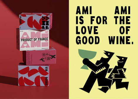
- Food Packaging
- Creating visually appealing packaging designs for food products can enhance brand recognition and increase sales.
- Beverage Packaging
- Using unique container designs for beverages can create a memorable brand experience for consumers.
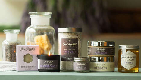
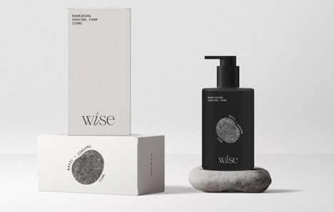
- Personal Care Packaging
- Embossed or sculpted details can add a luxurious or high-end feel to personal care product packaging.