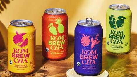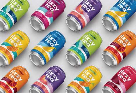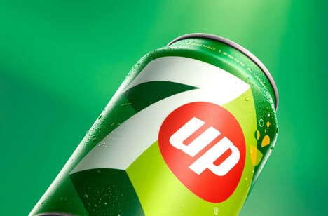
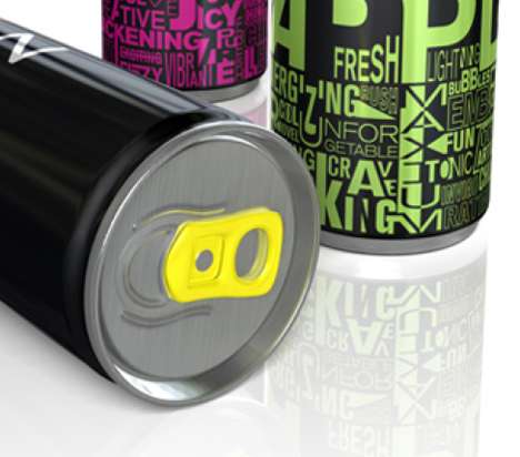
The new packaging for the Zoda Energy Drink, which was designed by graphic design company Silky Szeto, is bold and eye-catching. While the design for the Zoda Energy Drink lacks an intricate or expertly drawn set of images, the colors and minimalistic representation are visually appealing.
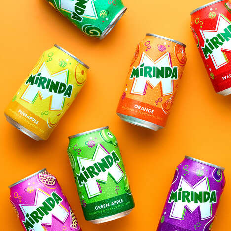
Each of the three bottle designs is black and features a different colorway: vibrant yellow, neon green or bold fuchsia. Different words such as "fresh," "energizing" and "functioning" are printed onto the black can. Each Zoda Energy Drink also contains a brightly hued tab to give it a very modern and edgy look.
Implications - Businesses that focus on simple and bold design will likely accomplish better results than their counterparts with complicated and busy product presentations. Consumers will be drawn to those products that are simple, yet modern.
Key Themes Behind This Trend
- Minimalistic Packaging Design
- Businesses that focus on bold and simple designs for their products will appeal to consumers who prefer minimalistic packaging.
- Bright and Bold Colorways
- Using bright and bold colorways in product packaging can attract consumers looking for visually appealing designs.
- Edgy Packaging Features
- Incorporating edgy features like brightly hued tabs in packaging can make products stand out on shelves and appeal to modern consumers.
Where This Applies
- Beverage Industry
- Companies in the beverage industry can adopt minimalistic packaging designs and bright colorways to appeal to modern consumers.
- Graphic Design Industry
- Graphic design companies can focus on creating bold and simple designs with edgy features to help their clients' products stand out on shelves.
- Consumer Goods Industry
- Businesses in the consumer goods industry can incorporate minimalistic packaging designs with bright colorways and edgy features to appeal to modern consumers.