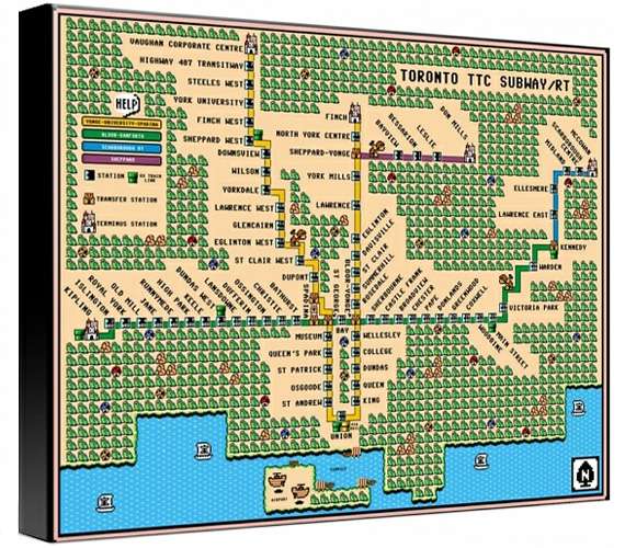
This old-school Super Mario TTC map by Dave Delisle is an awesome interpretation of the Canadian city's highly contentious public transit system.
Using a fairly simple transit system, this is a legible and impressive adaptation, and a brand new way of seeing the city. Using the original and familiar colors, format and font, this looks exactly like an 8-bit game at first glance. Quickly going viral among Torontonians and even those outside of the city, this is a graphic design masterpiece and a very retro way of depicting space. Even going so far as to depict which areas are more dangerous by using well-known icons, the graphic map is surprisingly detailed considering its low resolution style.
Arguably providing a more helpful look at Toronto than other more traditional maps, this is a fun and creative take on graphic art.
Key Themes Behind This Trend
- Retro Graphic Design
- Opportunity for businesses in the design industry to create nostalgic and visually appealing products or services inspired by retro aesthetics.
- Alternative Mapping Techniques
- Potential for technology companies to develop innovative mapping solutions that offer unique and engaging ways to visualize cities and public transit systems.
- Gamification of Urban Spaces
- Disruptive opportunity for companies to integrate gaming elements into cities, enhancing public engagement and exploration through interactive experiences.
Where This Applies
- Graphic Design
- Businesses in the graphic design industry can leverage the popularity of retro aesthetics to attract a nostalgic consumer base.
- Technology
- Technology companies can capitalize on the demand for alternative mapping techniques by developing innovative solutions that provide unique visual representations of urban spaces and transit systems.
- Urban Planning
- Urban planning and development organizations can explore the potential of gamifying urban spaces to create interactive and engaging environments for residents and visitors.