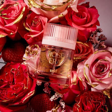
Rosita is a rose water brand concept developed by Parisian agency JOAM. In order to create a delicate, feminine branding scheme that still felt modern, JOAM used a dusty rose pink and rose imagery that also lend itself to the artisan portion of the fictitious brand.
The Rosita logo is rose that resembles a wax seal and appears on the packaging in an embossed red color. The logo is also repeated in order to create a pattern for other promotional material, such as shopping bags and business cards. In their description of the project, JOAM describes the decision to use a serif font as one that aligned with the goal of creating an artisanal look.
What's Driving This Trend
- Artisanal Branding
- Disruptive innovation opportunity: Combining traditional craftsmanship with modern design to create unique and authentic brand experiences.
- Rose Imagery
- Disruptive innovation opportunity: Exploring the symbolic and aesthetic appeal of roses in various industries to evoke sentiment and capture consumer attention.
- Serif Fonts
- Disruptive innovation opportunity: Utilizing serif fonts to convey a sense of heritage and craftsmanship in branding and design.
Who This Affects Most
- Beauty and Skincare
- Disruptive innovation opportunity: Developing artisanal products and packaging concepts in the beauty and skincare industry to cater to the growing demand for personalized and unique experiences.
- Hospitality and Luxury
- Disruptive innovation opportunity: Incorporating rose imagery and artisanal branding into hospitality and luxury sectors to enhance the overall customer experience and create a sense of exclusivity.
- Graphic Design and Advertising
- Disruptive innovation opportunity: Experimenting with serif fonts in graphic design and advertising to evoke a sense of craftsmanship and sophistication, attracting attention in a saturated market.