The Oi Emblem Changes Color and Shape When in Contact With Voice
M — April 16, 2016 — Art & Design
References: wolffolins & dezeen
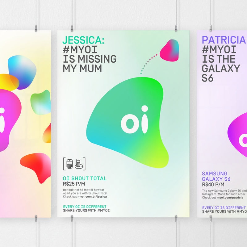
Oi is a South African telecommunication brand that features an interactive logo design by Wolff Olins that shifts in shape and color in response to the consumer's voice. The logo is fully malleable in its abstract blob design to move in response to the different pitch's in a person's voice that is nearby. The design offers a much more interactive brand emblem that engages the consumer as well as the brand's telecom services by reacting in response to their voice.
The logo is an abstract bobble that features the brand name Oi in the centre in a white typeface. When consumers are close to the logo, the emblem shifts in shape and color as it reacts to the different pitch levels. The different colors allude to the tone of the voice. For example, bluer colors depict a quiet and calm sound whereas vibrant reds denote higher pitches.
The logo is an abstract bobble that features the brand name Oi in the centre in a white typeface. When consumers are close to the logo, the emblem shifts in shape and color as it reacts to the different pitch levels. The different colors allude to the tone of the voice. For example, bluer colors depict a quiet and calm sound whereas vibrant reds denote higher pitches.
Trend Themes
-
Interactive Logos — Creating logos that respond and adapt to user inputs, such as voice, enhancing brand engagement.
-
Emotional Branding — Using color and shape changes in logos to evoke and reflect different emotions and tones.
-
Engaging Consumer Experience — Designing innovative brand emblems that actively interact with consumers, creating a memorable experience.
Industry Implications
-
Telecommunications — Integrating voice-responsive logos into telecom brands to enhance customer engagement and differentiate from competitors.
-
Marketing and Advertising — Leveraging interactive logo designs to create dynamic and attention-grabbing brand identities for clients.
-
User Experience Design — Exploring new ways to enhance user interaction and engagement through innovative logo design concepts.
6.1
Score
Popularity
Activity
Freshness


