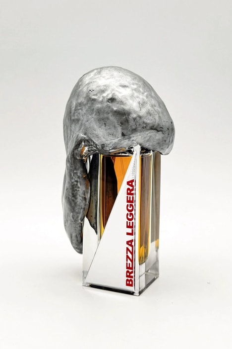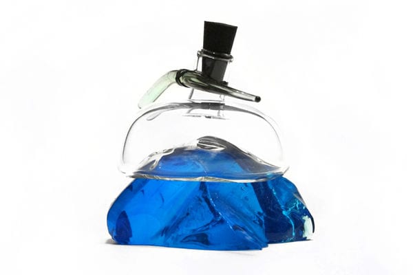
The perfume branding for Vilde uses a very minimalist look, resembling an ink-blotting strategy. The work was done as a project for school by Linda Hurtig from Sweden.
The assignment called for both a branding identity and ad to go with the perfume. Just looking at the images alone, it looks like Hurtig found her inspiration in nature, with the drawings resembling that of trees. In one illustration, the feeling evoked is that of spring time, when everything is starting to bloom. The next look is similar to fall, with the branches looking quite stark, placed on a blue-gray background.
The Vilde Perfume branding design evokes sentiments of nature, which should make consumers associate it with freshness. When it comes to scents, fresh is the way most people would love to smell after a quick spritz of a beauty product.
Key Themes Behind This Trend
- Minimalist Design
- Ink-blotted perfume packaging represents a trend towards minimalist design, creating a sleek and modern aesthetic.
- Nature-inspired Branding
- Vilde Perfume's use of nature-inspired illustrations suggests a trend towards brands that evoke sentiments of the natural world, tapping into consumers' desire for organic and eco-friendly products.
- Emotional Connection with Packaging
- The ink-blotting strategy used in Vilde Perfume's packaging design highlights a trend towards creating packaging that evokes emotions, fostering a deeper connection between the consumer and the product.
Where This Applies
- Perfume Industry
- The perfume industry can explore minimalist design principles and nature-inspired branding to create innovative packaging and connect with eco-conscious consumers.
- Beauty Industry
- The beauty industry can leverage minimalist design and nature-inspired branding to develop unique packaging for their products, emphasizing organic and fresh qualities to appeal to consumers seeking natural beauty solutions.
- Graphic Design Industry
- The graphic design industry can focus on the trend of emotional connection with packaging to develop innovative and visually captivating branding strategies that resonate with consumers and create memorable experiences.