Everybody loves a picnic, and this paper cup typography by Márcio Ramos de Sá shows how picnics and font design can go hand in hand. He's spelled out 'Piquenique' (picnic in Portuguese) in paper cups amid bright green grass. The serif in the typography itself lends an elegant feel to what would otherwise be a utilitarian word.
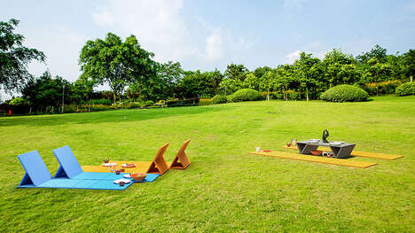
Check out more paper cup typography above, and keep clicking for other beautiful outdoor font features.
Implications - Shoppers are attracted to products that are made with familiar everyday items. Designs that are relatable appeal to shoppers who desire a closer connection to what they purchase.
Why This Trend Is Growing
- Everyday Object Design
- Designing everyday items in a creative and innovative way to attract consumers.
- Outdoor Font Features
- Utilizing outdoor spaces to display font designs and create unique branding opportunities.
- Relatable Design
- Designs that are relatable and appeal to shoppers who desire a closer connection to what they purchase.
Industries Being Reshaped
- Graphic Design
- Utilizing creativity to design everyday items with unique branding opportunities.
- Packaging
- Innovating packaging designs to be relatable and attract consumers.
- Advertising
- Creating outdoor font features to showcase brand creativity and messaging.