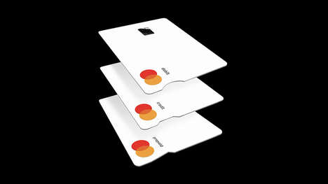
The Mastercard logo is one of the most well-known corporate symbols in the world, however a recent change to the American financial services brand shows that the company is looking to modernize its image for the digital age.
Rather than the interlocking red and yellow circles that the Mastercard logo was previously comprised of, the new look shows the two slightly transparent circles overlapping with the company name written beneath. The name's typography and use of capitalization has also been changed, now depicted with sleek all-lowercase lettering.
Though many are skeptical of the Mastercard logo change due to the universal recognition of its former look, the company's aim is to make the brand better work into digital contexts by implementing a more simplistic design. The logo's creator, Michael Bierut, explained this by saying "To me, MasterCard doesn’t want to be known as the company with the ingenious logo; they just want to make sure they’ve got a set of visual assets for them to navigate the world as it is now.”
Why This Trend Is Growing
- Simplistic Logos
- Companies will be interested in redesigning their logos to make them work better in digital contexts.
- Digital Branding
- There will be a push towards modernizing the image of companies to keep up with the digital age.
- All-lowercase Typography
- The use of all-lowercase lettering may become a popular trend in typography for corporate logos.
Industries Being Reshaped
- Finance
- Financial institutions may consider rebranding to appear more modern and streamlined, especially for online banking purposes.
- Marketing and Advertising
- Branding and advertising agencies may see an increased demand for logo redesigns that focus on simplifying and streamlining the design for digital use.
- Graphic Design and Typography
- The new Mastercard logo may inspire graphic design and typography industries to further explore the use of simple, all-lowercase typography in logo design.