This typographic analysis of President Obama's Inauguration Day speech by Martin Pyper was created for the Dutch magazine Creatie.
Pyper watched Obama's Inauguration Day speech on YouTube and created pie graphs and charts based on the recurring words Obama used and the emphasis he placed in key sections. There are even different fonts in the analysis, ranging from Obama Humble to Obama Black.
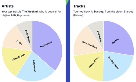
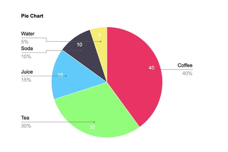
Implications - The digital age is a culture that is defined in large part by its abundance of information. Consumers are compelled by visual statistics that create a narrative. Brands should consider how they leverage storytelling to bolster their connection with consumers. Infographics of a brand's involvement in social causes is a great example.
What Makes This Trend Stand Out
- Visual Statistics
- Opportunity for brands to use visual statistics to create a narrative and connect with consumers.
- Storytelling
- Brands can leverage storytelling to enhance their connection with consumers.
- Infographics
- Using infographics to showcase a brand's involvement in social causes is an effective strategy.
Sectors Adopting This
- Marketing and Advertising
- Companies in the marketing and advertising industry can adopt visual statistics and storytelling techniques to enhance brand connection.
- Graphic Design
- The graphic design industry can benefit from the demand for infographics and visual representation of data.
- Digital Media
- Digital media platforms can explore new ways to present information through visual stats and storytelling methods.