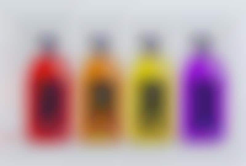
Anastasia Bakusheva developed a conceptual packaging design for 'Lotte,' a brand that offers natural, 100% organic juices.
Although there are many bottled juice beverages that are packaged in a similar fashion, Lotte sets itself apart by embracing some of the qualities of the Bauhaus design movement. Products in the range from Lotte include cranberry, orange, lemon and grape, each of which is distinguished by a color-coded bottle and meaningful geometric icons. As Bakusheva describes: "the main colours are red, yellow, violet and orange which is similar to Bauhaus colours and make the design of the package more clean and bright."
As a whole, the simple, minimalist bottles stand out against other juice bottles that favor softer, botanical designs.
What's Driving This Trend
- Minimalist Packaging
- The concept of Bauhaus-inspired juice bottles demonstrates the trend of minimalist packaging, which offers a clean and bright design.
- Color-coded Branding
- The use of color-coded bottles in Lotte's juice range reflects the trend of color-coded branding, providing clear and distinguishable packaging for different flavors.
- Incorporating Geometric Icons
- The inclusion of meaningful geometric icons on the bottles aligns with the trend of incorporating visuals to enhance packaging design and communicate product attributes.
Who This Affects Most
- Beverage Packaging
- The concept of Bauhaus-inspired juice bottles presents disruptive innovation opportunities in the beverage packaging industry, offering a unique visual aesthetic and branding approach.
- Organic Juice
- The Lotte brand's use of minimalist packaging with color-coded bottles and geometric icons represents a disruptive innovation opportunity in the organic juice industry, attracting customers with an appealing and distinctive visual identity.
- Graphic Design
- The concept of Bauhaus-inspired juice bottles showcases an opportunity for disruptive innovation in the graphic design industry, where minimalist, color-coded packaging with geometric icons can elevate branding efforts.