Jason Bishop has created quite an impressive infograph which gives viewers more information on the extent of damage the oil spill has caused on marine life. The infograph shows the different layers of the ocean and where the various marine life live.
Jason Bishop’s infograph not only explains the oil spill using imagery, but also includes question marks attached to each image that feature more information on just how damaging the oil has been to the environment.
Key Themes Behind This Trend
- Interactive-infographics
- Developing interactive infographics that enhance understanding of complex topics.
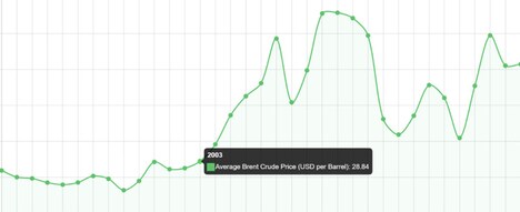
- Environmental-impact
- Increasing awareness and concern for the environmental impact of oil spills.
- Data-visualization
- Innovating data visualization techniques to convey complex information effectively.
Where This Applies
- Marine-conservation
- Reevaluating marine conservation strategies in response to the damaging effects of oil spills.
- Education-technology
- Integrating interactive infographics into educational materials to engage learners.
- Environmental-consulting
- Providing expert analysis and solutions for minimizing the environmental impact of oil spills.