Glorious! by Lambie-Nairn Embraces Global Flavors
Amelia Roblin — August 15, 2011 — Marketing
References: lambie-nairn & lovelypackage
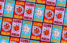
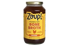
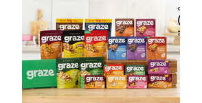
Anyone can make a bland meal at home, which is why the new brand identity for Glorious! by Lambie-Nairn is bound to experience a spicy success on the shelves of the supermarket. The imaginative graphic design studio has embraced the colorful "A-Z of Global Flavours" attitude of the unconventional company to effectively conceive the perfect image for its packaging.
Using base shades of black and white on the tubs, containers, thermoses and printed materials, L-N has been able to visually project the vivid bespoke typography that brands each soup and "Skinny Dip" product. One letter of the alphabet marks every item according to its name, and has been rendered to represent the savor and cultural character of the dish for Glorious! by Lambie-Nairn.
Using base shades of black and white on the tubs, containers, thermoses and printed materials, L-N has been able to visually project the vivid bespoke typography that brands each soup and "Skinny Dip" product. One letter of the alphabet marks every item according to its name, and has been rendered to represent the savor and cultural character of the dish for Glorious! by Lambie-Nairn.
Trend Themes
-
Global Flavors — There is an opportunity for businesses to embrace global flavors and incorporate them into their branding, creating unique and exciting products for consumers.
-
Imaginative Graphic Design — Incorporating imaginative graphic design elements into product packaging can help brands stand out on the shelves and attract consumer attention.
-
Bespoke Typography — Using bespoke typography that captures the essence of a product can enhance brand identity and create a memorable visual experience for consumers.
Industry Implications
-
Food and Beverage — The food and beverage industry can benefit from incorporating global flavors and creative graphic design to differentiate their products and appeal to a wider consumer base.
-
Package Design — There is an opportunity for disruptive innovation in the package design industry by incorporating unique typography and visual elements that captivate consumers and enhance brand recognition.
-
Marketing and Advertising — Marketing and advertising agencies can help brands leverage imaginative graphic design and bespoke typography to create visually striking campaigns that capture consumer attention and drive brand recognition.
4.1
Score
Popularity
Activity
Freshness
