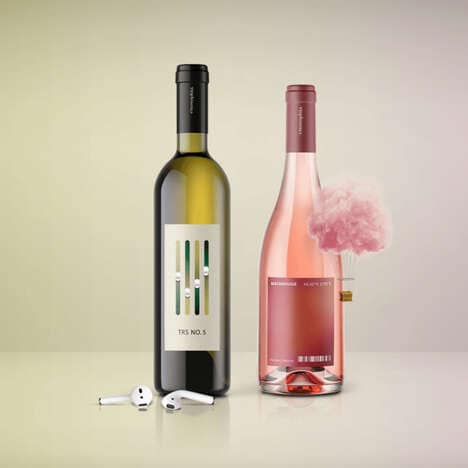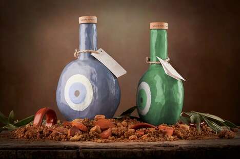
Often a bit of mystery behind a recipe improves the experience and the quality of its taste, which is why El Secreto wine packaging is bound to intrigue the average connoisseur. The Side Effects studio of Spain designed the label for the Montreaga brand, executing it with an imaginative symbol of a highly stylized eye.
The idea that the ocular imagery evokes is one of searching and discovering, even more so in a clandestine manner. With no brow or cheekbone visible around the curious peeper, the delicate illustration perhaps renders a sneak peek through the keyhole of a door. With this in mind, El Secreto wine packaging subtly suggests an accessibility of the drink's secret, reserved for those who sip every drop with sensitivity.
What's Driving This Trend
- Mysterious Packaging
- Opportunity for brands to create packaging that evokes intrigue and curiosity.
- Immersion and Discovery
- Potential for products to enhance customer experience by offering a sense of searching and discovery.
- Symbolic Imagery
- Demand for design elements that convey symbolic meaning and evoke emotional connections with consumers.
Who This Affects Most
- Wine and Spirits
- Disruptive innovation opportunities in wine and spirits packaging, focusing on mystery and exclusivity.
- Design and Branding
- Opportunities for designers and branding professionals to explore unconventional packaging concepts.
- Customer Experience
- Potential for businesses to enhance customer experience through immersive and captivating packaging designs.