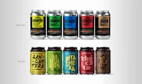

The El Cultivador packaging designed for the ALDI supermarkets in Spain was put together by Enric Aguilera Asociados, using letters of the alphabet to represent the goods inside of cans, jars, containers and bottles.
The alphabetical packaging system was developed as a simple way to group the different families of preserves with different typefaces. Different types of olives are packaged with the same style of lettering, and canned goods are labeled in the same way, with a different style of typeface. Since there are numerous product lines that could be added onto the El Cultivador line in the future, this is a clever and extremely easy way to go about organizing various product types since it would be as easy as adding a new typeface to the new type of food.
What Makes This Trend Stand Out
- Alphabetical Packaging
- Using letters of the alphabet to represent different product types in packaging, creating a simple and effective way to organize products.
- Customized Typefaces
- Using different typefaces for different product families, allowing for easy identification and organization of products.
- Expandable Product Line
- Creating a packaging system that can easily accommodate new product types by adding new typefaces.
Sectors Adopting This
- Food Packaging
- Incorporating alphabetical packaging and customized typefaces to create organized and visually appealing packaging for food products.
- Supermarkets/retail
- Implementing the alphabetical packaging system to streamline product organization and improve the shopping experience for customers.
- Graphic Design
- Utilizing different typefaces in packaging design to create visually distinctive and aesthetically pleasing product packaging.