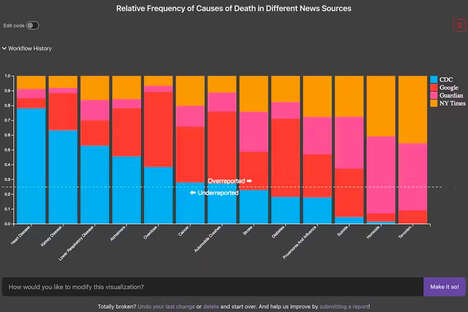
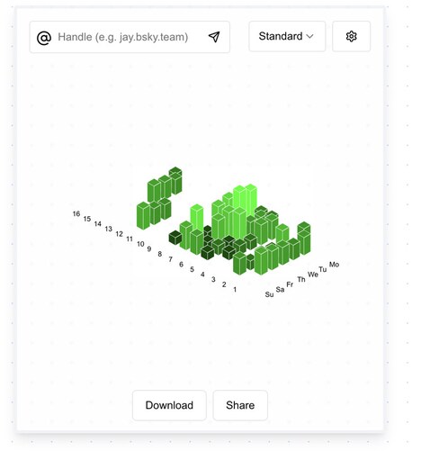
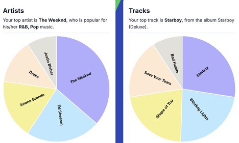
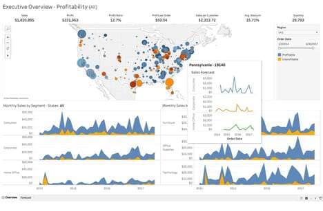
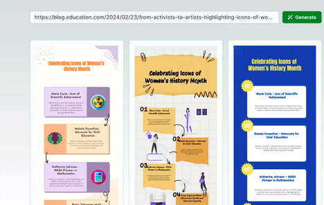
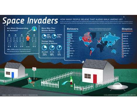
Data visualization presents or clarifies ideas using images, and the folks who spend their lives scheming clever ways to make us understand concepts through images wrestle with the question of whether visualizing data visualization is possible.
With electronic information delivery, we are increasingly oriented to receiving information visually. There is much discussion and several innovative approaches to illustrating the concept: The one that I like best (so far) is a beautiful, three-layer color-wheel-like approach by FFunction that overlaps information, design and communication.
The video, which is fantastic, is based on the TED speech by David McCandless.
What Makes This Trend Stand Out
- Data Visualization
- Innovative ways to represent data using images for easy understanding
- Information Delivery
- Electronic platforms and visual aids for information conveyance
- Color Wheels
- Integrating color theory into data visualization for better comprehension
Sectors Adopting This
- Design
- Incorporating data visualization in design for better communication
- Marketing
- Effective data visualization for brand and product promotion
- Education
- Visual aids and color-coded charts for easy comprehension in learning environments