
Having designed her own craft cider brand targeted towards 18 to 25 year-olds from scratch for a competition, university student Dani Kaspar did it just right when it came to creative branding, winning the annual Student Ampersand Award for Creative Excellence.
Held by packaging design agency Cowan, the competition gave communication artist Kapar the platform to play around with creative branding and the space to experiment with design and typography for the cider market.
Going for a social look and choosing a playful name, the Flying Pig brand was designed with an emphasis on its use of organic fruits to target younger markets. The design of the rounded bottle shape, its brightly colored hues and bold graphic typeface give the Flying Pig cider just the right balance between social and playful.
Why This Trend Is Growing
- Craft Cider
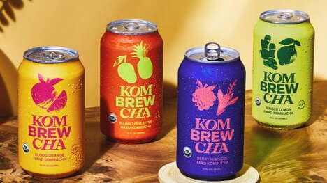
- Craft cider brands are targeting younger markets with playful branding and emphasis on organic fruits.
- Creative Branding
- Brands are using creative design and typography to stand out in the cider market.
- Youthful Packaging
- Cider brands are opting for rounded bottle shapes, vibrant colors, and bold typefaces to appeal to the younger demographic.
Industries Being Reshaped
- Craft Cider Industry
- Craft cider industry can capitalize on targeting younger markets through playful branding and organic fruit emphasis.
- Packaging Design Industry
- Packaging design agencies have an opportunity to help cider brands stand out by offering creative branding solutions.
- Beverage Industry
- Cider brands can disrupt the beverage industry by appealing to the younger demographic with vibrant packaging and organic fruit emphasis.