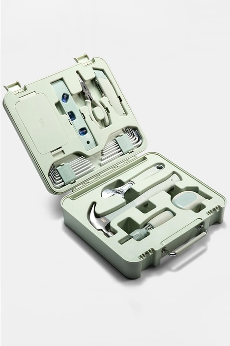
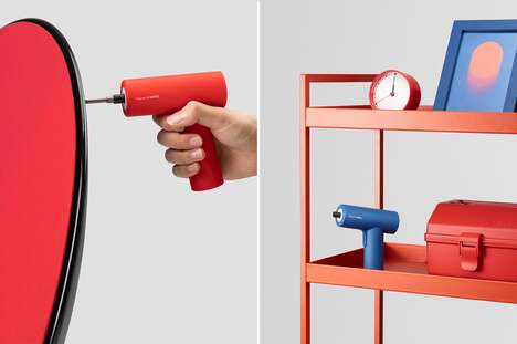
Cinch is a brand of hardware aimed towards men who are not the best with tools. As the name indicates, this line of tools can be understood by even some of the most oblivious people, who just want things explained in the most simple manner possible.
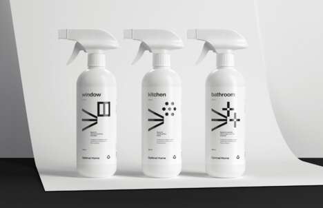
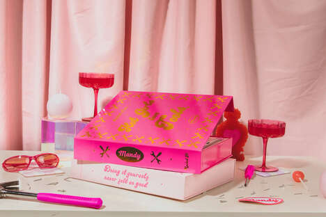
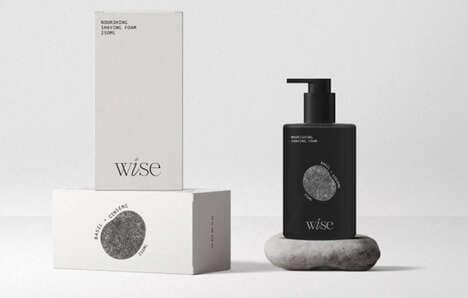
The branding overall reflects this easy to understand nature of the hardware, as everything is done with a clean and basic font, with green being the main color motif throughout. Pinks and reds are also punctuated on certain designs, but overall Sarah Schmidt, the graphic designer on the project, kept things quite straightforward and simple.
For those men out there who just do not understand tools and hardware in general, Cinch is a great place to start.
What Makes This Trend Stand Out
- Simplified Industrial Products
- Creating industrial products that can be easily understood and used by individuals without technical expertise.
- User-friendly Branding
- Designing branding that reflects the simple, easy-to-use nature of the product.
- Accessibility-focused Marketing
- Targeting individuals who are not familiar with industrial products or who feel intimidated by them.
Sectors Adopting This
- Hardware and Tools
- Making tools and hardware that can be easily understood by individuals who do not have technical experience.
- Graphic Design
- Providing branding services that focus on simplicity and user-friendliness.
- Marketing and Advertising
- Developing marketing strategies that focus on accessibility and ease-of-use for those who may feel intimidated by traditional industrial products.