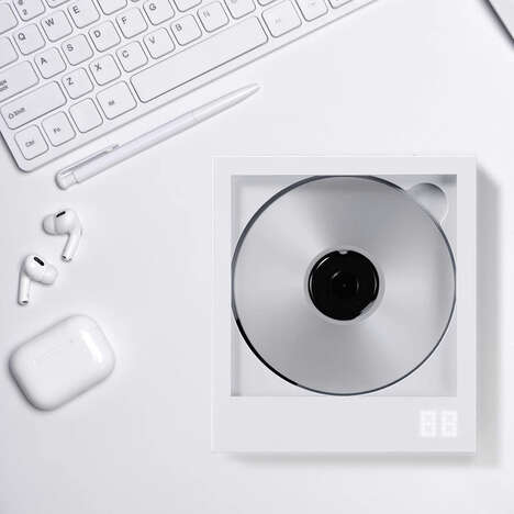

This understated cd packaging was created by Hong Kong-based creative agency Trilingua Design. The studio conceived the brand identity for a famous singer from their hometown and chose to come up with an album design that marries vintage and modern elements.
While this cd packaging's minimalist color scheme embodies a contemporary design style, its typography is more vintage in its overall inspiration. All of this album's text is applied using a letterpress and is an ode to retro written materials.
Rejecting digitized fonts and graphics that are tech-assisted, this letterpress cd packaging promotes the practice of handcrafted design and is reflective of today's evolving maker culture. Despite of their reliance on technology, Millennial innovators and creatives are going back to their DIY roots by bringing hands-on yet contemporary projects to life.
What's Driving This Trend
- Minimalist Design
- There is an opportunity for businesses to embrace minimalism in their product and packaging design.
- Combining Vintage and Modern Elements
- By combining vintage and modern elements in their design, businesses can create a unique and memorable brand image.
- Handcrafted Design
- There is an opportunity for businesses to promote the practice of handcrafted design and cater to the evolving maker culture.
Who This Affects Most
- Music Industry
- The music industry can benefit from incorporating minimalism and vintage elements into their album designs.
- Graphic Design Industry
- The graphic design industry can embrace the trend of handcrafted designs and promote the value of handiwork in their creations.
- Consumer Goods Industry
- The consumer goods industry can differentiate themselves by incorporating minimalism and vintage design elements into their packaging and product design.