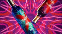
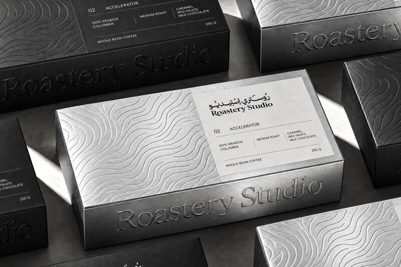
Roastery Studio is getting a packaging identity that makes its coffee easier to spot across grab-and-go and take-home formats, using metallic surfaces, bold color, and Arabic-English type instead of one repeated label. Designed by ahmedraoudgfx, the system carries the brand from bags to cups with a sharper, more tactile look.
An embossed wave on the silver bag turns the finish into a cue people can notice and feel, not just a printed graphic. The red cup then shifts the palette without losing recognition, so the range stays connected even when the format changes.
Because the identity adapts to different surfaces and proportions rather than locking every piece into the same layout, Roastery Studio gets consistency without sameness. The flash-lit café presentation also keeps texture and contrast at the center, reinforcing a brand expression tied to everyday coffee rituals.
Image Credit: ahmedraoudgfx
Key Themes Behind This Trend
- Bilingual Brand Systems
- Dual-language typography is becoming a premium packaging signal, creating space for culturally fluent identities that feel local, inclusive, and export-ready.
- Tactile Metallic Packaging
- Embossed finishes and reflective substrates are reshaping shelf presence by turning packaging into a sensory cue that can be recognized by sight and touch.
- Adaptive Packaging Identities
- Flexible design systems across cups, bags, and retail formats allow brands to maintain recognition while avoiding repetitive layouts that flatten product experiences.
Where This Applies
- Specialty Coffee
- Independent roasters can differentiate crowded grab-and-go and take-home offerings through packaging that elevates daily rituals with materiality and multilingual storytelling.
- Packaging Design
- Studios have growing opportunities to build modular visual systems that translate across irregular surfaces, sizes, and consumer touchpoints without sacrificing cohesion.
- Food and Beverage Retail
- Retail environments benefit from high-contrast, tactile packaging that strengthens product visibility and turns ordinary purchases into more distinctive branded moments.