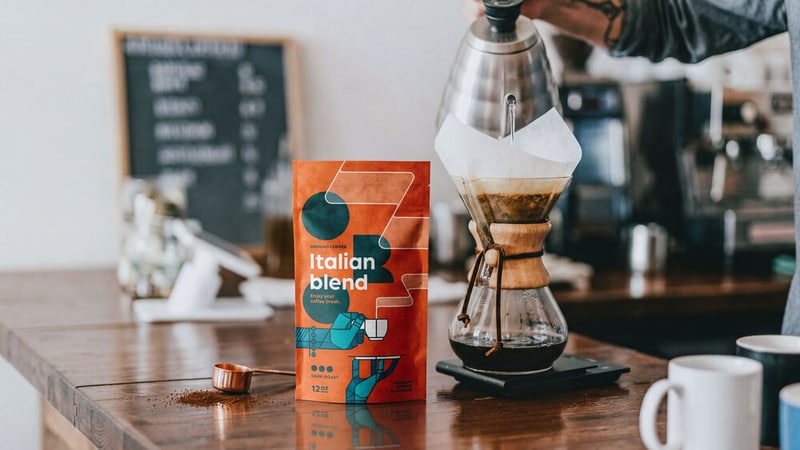
ORO is a conceptual coffee packaging project created by design studio 3rd Floor for a fictional premium coffee brand, featuring a modular identity system built around bold typography, geometric illustrations and color-coded blend variations. The packaging uses a fixed structural framework paired with illustrated hand-and-cup compositions to give each coffee variant a distinct personality while maintaining a unified shelf presence across the range.
The project extends beyond packaging into promotional applications, campaign visuals and branded merchandise concepts to demonstrate how the visual identity could scale consistently across retail and advertising environments. By combining expressive illustration with disciplined branding rules, the system was designed to support future blend expansion without losing recognizability or visual cohesion.
For retailers and consumer brands, ORO illustrates how modular packaging systems can improve shelf differentiation while supporting scalable product-line growth. The concept reflects broader design trends favoring flexible identity systems that balance storytelling, consistency and standout visual impact across physical and digital touchpoints.
Image Credit: 3rd Floor
What Makes This Trend Stand Out
- Modular Packaging Systems
- A fixed structural framework with interchangeable visual elements creates possibilities for rapid product-line expansion while preserving shelf cohesion and consumer recognition.
- Bold Geometric Typography
- Strong, geometric typefaces paired with minimalist illustrations produce high-contrast shelf presence that can redefine premium cues in crowded retail environments.
- Scalable Brand Identity
- A disciplined set of branding rules that adapt across pack formats and promotional channels supports consistent storytelling as assortments and touchpoints multiply.
Sectors Adopting This
- Specialty Coffee Retail
- Retailers could benefit from packaging systems that differentiate blends visually while enabling streamlined inventory and merchandising for rotating small-batch offerings.
- Consumer Packaged Goods
- CPG firms may see opportunities in modular visual frameworks that reduce redesign costs and accelerate market testing for new SKUs.
- Branding and Design Agencies
- Agencies offering flexible identity toolkits can expand service models by delivering scalable systems that maintain creative expression across physical and digital campaigns.