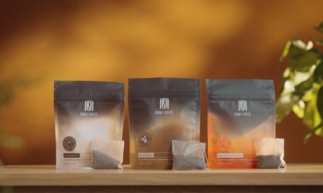
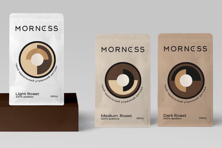
MORNESS is a premium whole-bean coffee brand introduced with a new visual identity designed by Anastasia Korsakova, featuring packaging and a logo built to evoke a daily morning ritual. The work was developed to communicate premium quality, comfort and trust through tactile materials and refined typography, with an emphasis on aromatic, flavour-forward beans.
The design concept frames the cup as a transition device from quietude to focus, using calm colorways and restrained marks to suggest ritual and productivity. Korsakova’s approach included packaging structure, label hierarchy and a logo system intended for shelf presence and at-home routine. For consumers, the package aims to elevate the everyday brew into a deliberate start-of-day moment, aligning with trends toward ritualized, design-forward food and beverage experiences.
Image Credit: Anastasia Korsakova, MORNESS
Key Themes Behind This Trend
- Ritualized Morning Consumption
- Elevating everyday coffee-drinking into a deliberate ritual opens opportunities for products that redefine the start-of-day experience through sensory storytelling and routine-focused design.
- Design-forward Packaging
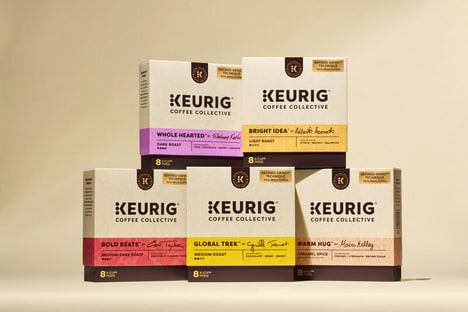
- Packaging treated as a brand touchpoint is enabling formats that prioritize shelf presence and visual calm, creating space for premium, design-led offerings to disrupt commodity markets.
- Tactile Materials in Branding
- The use of textured papers and refined typographic systems points to novel material-led differentiation, inviting innovations in sustainable, multisensory packaging that command premium pricing.
Where This Applies
- Specialty Coffee Retail
- A focus on aromatic, flavour-forward beans paired with ritual-centric branding signals potential for curated in-store and at-home experiences that shift customer expectations away from mass-market options.
- Packaging Design and Manufacturing
- Demand for tactile, premium-grade packaging suggests opportunities for manufacturers to develop cost-effective, sustainable substrates and structural solutions tailored to elevated brand narratives.
- Subscription D2C Food and Beverage
- Routine-oriented products aligned with morning rituals indicate room for subscription models that deliver consistent sensory experiences and deepen lifetime customer relationships.