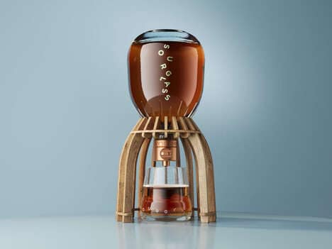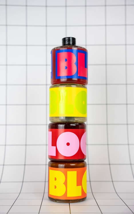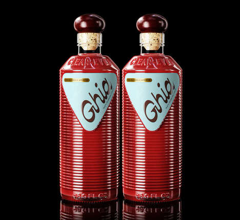
The Saltmine has created a new look for the popular Australian drink Angostura Bitters. The new design stays true to the original bottle, but adds a much more typographic treatment. A lot of different fonts are used as well as a signature from the creator Dr J.G.B. Siegert.
The Angostura Bitters would be a great drink to have at a party if you want to avoid an awkward situation and look busy doing something. There is so much to read on that bottle!
What's Driving This Trend
- Typography-driven Packaging
- Opportunity for brands to use typography as a central design element in packaging to capture consumer attention and engagement.
- Signature Design
- Potential for incorporating creator signatures in packaging design to enhance authenticity and brand storytelling.
- Information-loaded Packaging
- Rise in demand for packaging that provides consumers with a wealth of information, enabling them to make informed purchasing decisions.
Who This Affects Most
- Beverage
- Opportunity for beverage companies to utilize typography and signature design in their packaging to differentiate their products in a crowded market.
- Graphic Design
- Potential for graphic designers to specialize in typography-driven packaging design, helping brands create visually impactful and engaging packaging.
- Consumer Goods
- Growing need for consumer goods companies to prioritize informative packaging designs that provide consumers with relevant product information to drive purchasing decisions.