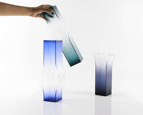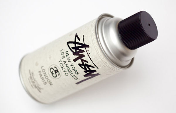
The right color can make a surface pop, and perhaps that is the theory behind Acrilex Decor Paint packaging. These cans of spray paint look to be marketed towards the more artsy types, as the branding reaches out to describe the product's formal appeal.
Da Urca Comunicaca of Brazil began by designing these metal bottles with a clever white base. Referencing the clean slate of a primed canvas, the creative team then carefully applied a compelling visual texture to much of the glossy surface. An M. C. Escher sort of pattern was chosen to establish a false three dimensionality, using geometric shapes in various shades of the product's primary tint. Acrilex Decor Paint packaging strives to communicate the effect of the finished product to the consumer.
What Makes This Trend Stand Out
- Visual Texture Packaging
- Opportunities for creating visually engaging packaging designs using intricate textures.
- Illusionary Branding
- Potential for using optical illusions in branding to create a sense of depth and intrigue.
- Artistic Targeted Marketing
- Opportunities to market products to the artsy consumer segment by emphasizing formal appeal and visual aesthetics.
Sectors Adopting This
- Packaging Design
- Disruptive innovation opportunities in creating unique packaging designs that employ visual textures and illusions.
- Marketing and Advertising
- Opportunities to explore new approaches in branding and marketing strategies by incorporating optical illusions and appealing to art-focused consumers.
- Arts and Crafts Supplies
- Innovations in product design and packaging for arts and crafts supplies that enhance the visual appeal and artistic experience for consumers.