


Mimi's Nuts Branding Conjures the References to Handmade Goods
Amelia Roblin — March 13, 2014 — Life-Stages
References: drewwatts & lovelypackage
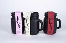
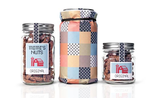
A charming homespun image was created for Mimi's Nuts branding with the goal of communicating the care behind the snacks' production. Designer Drew Watts wanted to develop an identity for the edibles that was as wholesome as homemade and home-sourced foods, and a reference to traditional crafts afforded this opportunity.
The stationery and the labels of the jam jars were printed with patterns and icons made up of tiny X-shaped marks, reminiscent of embroidery. Each flavorful variety was assigned its own relevant picture, executed fairly simply and with lovely cheerful colors. The name of the brand has even been worked into the printed needlework so that it looks as if a fabric patch was simply stuck onto each item of Mimi's Nuts packaging. To complete them, the mason jars were sealed off with ribbon-like stickers.
The stationery and the labels of the jam jars were printed with patterns and icons made up of tiny X-shaped marks, reminiscent of embroidery. Each flavorful variety was assigned its own relevant picture, executed fairly simply and with lovely cheerful colors. The name of the brand has even been worked into the printed needlework so that it looks as if a fabric patch was simply stuck onto each item of Mimi's Nuts packaging. To complete them, the mason jars were sealed off with ribbon-like stickers.
3.6
Score
Popularity
Activity
Freshness