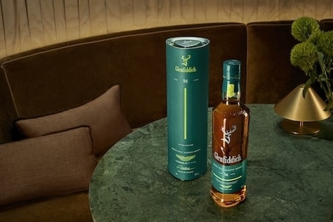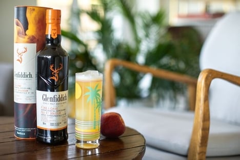
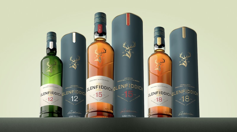
The single malt Scotch whisky brand Glenfiddich has introduced a new visual identity for its packaging. This latest marketing move refreshes the iconic stag emblem, wordmark, label architecture, and embossed detailing to create what the company describes as a blend of "bold restraint and refined textural detailing."
Glenfiddich's visual identity redesign draws on icons from the family archive, which spans five generations. The stag is reimagined to show greater depth and movement while remaining inspired by the nineteenth-century painting 'The Monarch of the Glen.' The wordmark, on the other hand, continues to balance modern clarity with typographic references first seen on bottles in the 1960s. The Grant family crest now appears elevated and embossed on the packaging with the motto Stand Fast.
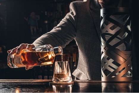
Despite the sophisticated visual identity overhaul, Glenfiddich's award-winning single malt Scotch whisky remains unchanged. The expressions are distilled in copper pot stills in Speyside, using water from the Robbie Dhu spring, and matured in carefully selected oak casks.
Image Credit: Glenfiddich
What Makes This Trend Stand Out
- Heritage Reinterpretation
- Reworking archival brand motifs into contemporary visual identities creates opportunities to differentiate premium products through storytelling-driven design and provenance signaling.
- Tactile-embossed Packaging
- Elevated embossing and textural detailing on labels and cartons suggest new avenues for sensory-rich packaging that enhances perceived value at point of sale.
- Typographic Revival
- Reviving mid-century wordmarks and typographic references opens possibilities for authentic-seeming typography systems that balance nostalgia with modern legibility.
Sectors Adopting This
- Luxury Spirits
- Premium alcohol brands can leverage refreshed visual identities to command higher price points and deepen collector appeal through limited editions and provenance narratives.
- Packaging Design
- Design studios and manufacturers may capitalize on demand for sophisticated materials and finishing techniques to offer bespoke, high-margin packaging solutions for heritage brands.
- Brand Licensing
- Extending revitalized emblems and crest treatments into licensed goods presents potential for cross-category collaborations that amplify brand reach while maintaining premium positioning.