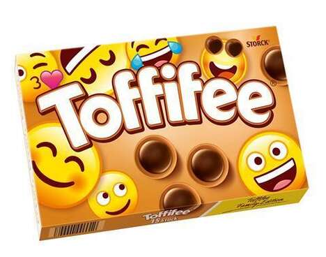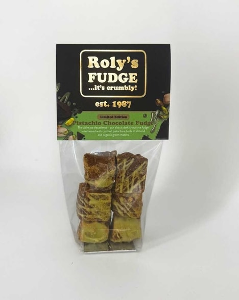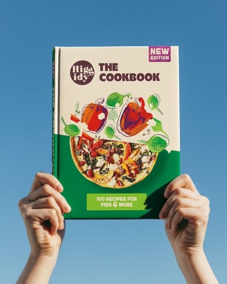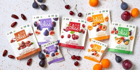
This vibrant fudge branding strategy would never go unnoticed on the shop shelf, for the graphics, the colors and the typography work together to create an in-your-face aesthetic splash.
Designed in-house at Aesop, Oh Fudge! packaging is much unlike the clean and muted design scheme that the consumer might expect from the company. Here is proof of the creative team's versatility. Three flavours of chocolate bars include Apple & Cinnamon, Caramel & Sea Salt and Chilli & Chocolate, and each one is decorated in a different but equally punchy way. Respectively, arrowed apples, schools of fish and clusters of penguins mark each little carton, rendered in bright orange, cherry red, neon green and turquoise. Curvy hand lettering is smooth and thick, serving up the friendly exclamation that's the name of the treat.
Why This Trend Is Growing
- Vibrant Packaging Design
- Exploring bold and eye-catching packaging designs that stand out on store shelves.
- Versatile Branding Strategies
- Developing adaptable branding strategies that showcase flexibility and creativity.
- Playful Typography and Graphics
- Incorporating lively and playful typography and graphics to create a memorable and engaging visual experience.
Industries Being Reshaped
- Confectionery
- Leveraging vibrant packaging designs in the confectionery industry to attract and captivate consumers.
- Food and Beverage
- Exploring versatile branding strategies in the food and beverage industry to differentiate products and engage customers.
- Design and Advertising
- Utilizing playful typography and graphics in the design and advertising industry to create compelling and memorable campaigns.