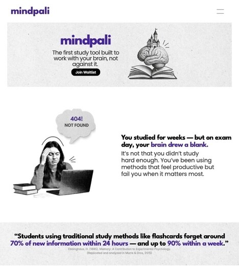
Created by researchers at Melbourne's RMIT University Behavioural Business Lab, Sans Forgetica is a unique new font that combines design principles and psychological theories. Deriving its name from a pun -- drawn from the font names Comic Sans and Helvetica -- Sans Forgetica is specially designed to ensure students remember what they have read. This is accomplished with a clever design that slants the letters seven degrees to the left and adds gaps int he structure of each letter.
These simple design changes aid memory by simply making the text harder to read. These obstacles force the reader's brain to work harder to decipher the text and in turn ensure that it retains the information better. According to Jo Peryman, chair of RMIT University's Behavioral Business Lab, "Sans Forgetica works by a learning principle called desirable difficulty, which is where an obstruction is added to the learning process in order to promote deeper cognitive processing."
What Makes This Trend Stand Out
- Memory-improving Fonts
- Sans Forgetica combines design principles and psychological theories to enhance text retention, providing an opportunity for innovation in the field of typography.
- Desirable Difficulty
- The concept of desirable difficulty, used in the creation of Sans Forgetica, presents an opportunity for disruptive innovation in educational tools and learning methods.
- Cognitive Processing Enhancement
- The use of obstructions to promote deeper cognitive processing, as demonstrated by Sans Forgetica, opens up opportunities for innovation in psychology and neuroscience research.
Sectors Adopting This
- Typography
- The development of memory-improving fonts like Sans Forgetica provides opportunities for innovation in the field of typography, particularly in designing fonts for educational materials.
- Education
- The application of desirable difficulty principles, as seen in Sans Forgetica, can lead to disruptive innovation in educational tools and techniques aimed at enhancing memory retention.
- Psychology
- The research behind Sans Forgetica's impact on cognitive processing creates opportunities for innovation in psychology, particularly in understanding and enhancing memory and learning processes.