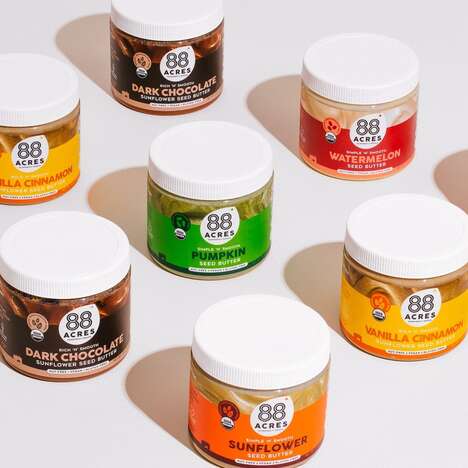
Roots & Bulbs swiftly recognized the development of juicing diets, and decided to open up a juice bar that catered to this form of healthy eating. Everything in their store is cold pressed, which helps keep in more nutrients from the fruits and vegetables.
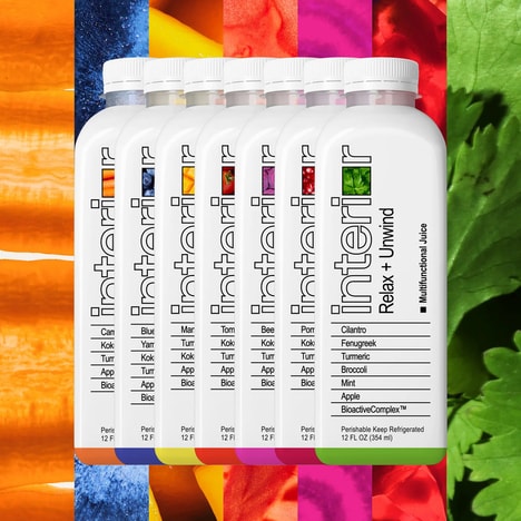
To brand the store, Roots & Bulbs went with Robot Food based in the UK. The branding agency wanted to use a minimalist design for the packaging, and creatively separated the the categories of juice through letters, including "‘G’ for Greens, ‘C’ for Carrot and ‘A’ for Almond Milk," as stated on Lovely Package. The lettering also relates to symbols for vitamins, which helps to convey that healthy aesthetic for drinking Roots & Bulbs.
What Makes This Trend Stand Out
- Minimalist Packaging Design
- Utilizing a minimalist design for packaging can enhance brand identity and attract health-conscious consumers.
- Categorization of Products
- Dividing products into informative categories can help customers easily identify their preferences and make informed choices.
- Juicing Diets
- The rise of juicing diets presents a growing market for businesses to cater to health-conscious consumers seeking nutrient-dense beverage options.
Sectors Adopting This
- Branding & Design
- Branding agencies can seize disruptive innovation opportunities by incorporating minimalist design and creative categorization strategies into their client's packaging projects.
- Food & Beverage
- The food and beverage industry can explore the juicing trend and develop innovative cold-pressed products that retain maximum nutrients for health-conscious consumers.
- Health & Wellness
- Health and wellness businesses can leverage the popularity of juicing diets to offer specialized services or products that cater to the nutritional needs of their customers.