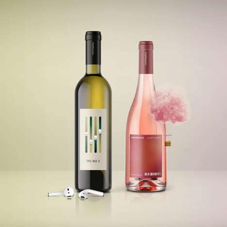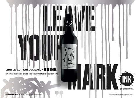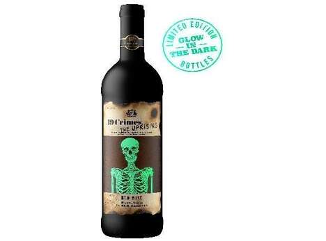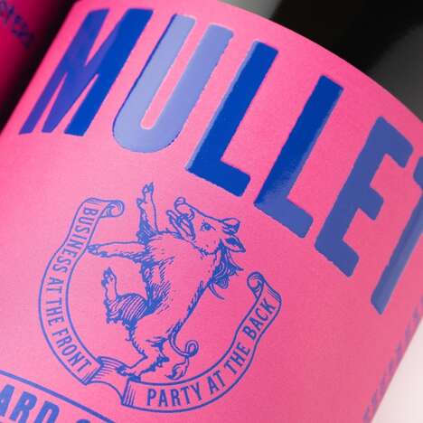
Rascallion Wines is a wine brand based in South Africa, which enlisted the creative agency G2Design to create the branding for its wine labels.
Each wine in the collection features a different word front and center, with the font that word is represented in designed to reflect the meaning of the word itself. For example, the wine named 'Aquiver' is featured in a font that appears to vibrate, while the wine named 'Susurrous' is revealed in font that features swirling patterns, to represent the "whispering" or "hum" that this term defines.
These Rascallion Wines first draw the eye with their bold labels, and then further grasp consumers' attention with their use of clever and distinctive branding.
Key Themes Behind This Trend
- Creative Label Design
- Opportunities exist for creative agencies to innovate on label design for alcoholic beverages.
- Meaningful Typography
- There is potential for designers to experiment with typography to enhance the meaning and identity of a product.
- Branding Through Word Play
- Brands can use playful word choice and typography to create unique and memorable experiences for consumers.
Where This Applies
- Alcoholic Beverages
- Innovative label design can help differentiate alcoholic beverages in a crowded and competitive industry.
- Graphic Design
- Graphic designers can use the success of Rascallion Wines' branding to inspire new approaches to design for a variety of industries.
- Boutique Consumer Goods
- Small producers of artisanal and specialized consumer goods can use creative branding to showcase their unique products and values.