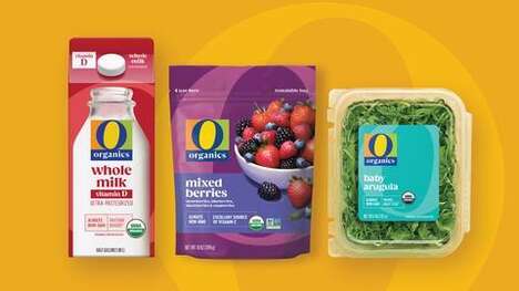
There is a simple yet aesthetically satisfying appeal to the new People's Supermarket packaging. Designed and Unreal, the branding for this London cooperative emporium really captures the everyman's attitude with respect to shelf presence.
The simple all-caps hard black typeface combined with the bright yellow background make for minimal product markings executed in an evidently well-structured manner. The People's Supermarket packaging will appeal to more customers and surely stand out on the rack.
Why This Trend Is Growing
- Minimalist Packaging
- By using a simple design with minimal product markings, brands can create packaging that stands out on the shelf.
- Cooperative Emporiums
- The rise of cooperative emporiums like People's Supermarket creates opportunities for brands to target this niche market with specialized products.
- Shelf Presence
- Brands can enhance their shelf presence by using bold and contrasting colors in their packaging design.
Industries Being Reshaped
- Retail
- Retailers can adopt minimalist packaging to differentiate their private label products and increase customer engagement.
- Food and Beverage
- Food and beverage brands can tap into the cooperative emporium market by partnering with cooperative retailers and creating unique offerings.
- Design
- Design agencies can help brands stand out on the shelf by creating visually appealing packaging with bold colors and minimalist design.