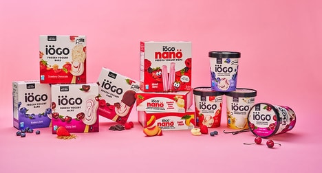
The Oello Frozen Yogurt packaging designed by Noote & Netoo is the perfect representation of the idea of iced treats.
According to Noote & Netoo, the Oello Frozen Yogurt design was thought of because, "Frozen yoghurt brings out the childlike innocence in all of us. We picked the name from incan goddess who taught the art of spinning."
With a basic palette of white and illustrations, splotches of watercolor add some fun to the already cute illustrations. With accents of greens, periwinkles and bright orange, the Oello Frozen Yogurt packaging is a minimalist and unique approach to carting around your frozen treats while walking in the hot summer sun.
What Makes This Trend Stand Out
- Watercolor Packaging
- Using watercolor illustrations on packaging to create a unique and attractive look for products.
- Minimalist Design
- Adopting a simplistic and clean aesthetic in product packaging to appeal to modern consumers.
- Playful Accents
- Incorporating playful and colorful elements into packaging designs to add a sense of fun and excitement.
Sectors Adopting This
- Frozen Desserts Industry
- Exploring innovative packaging designs for frozen dessert products that appeal to customers' sense of whimsy and creativity.
- Food and Beverage Packaging
- Applying watercolor and minimalist design trends to packaging solutions across various food and beverage products to enhance visual appeal.
- Art and Design Supplies
- Creating watercolor packaging products and materials tailored for artists and designers looking to incorporate unique visual elements in their work.