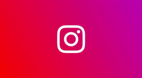
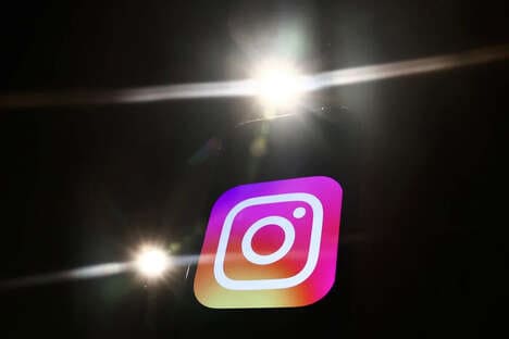
Instagram recently surprised users with its new app and icon design that features more aesthetically bold and user-friendly elements. In addition to its technicolored new logo design, the app also features a cleaner interface.
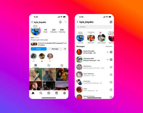
Stripping down everything, Instagram's new app design favors a minimalist black and white look. Embracing simplicity, this updated interface puts more focus on user's pictures and videos. Though subtle, the app update is already a hit among social media users who prefer simple and clutter-free web design. This change of icons has also been paired with Instagram's sister apps Layout, Boomerang, and Hyperlapse, which also received a minimalist makeover. All of the updates are now available for both iOS and Android devices.
Why This Trend Is Growing
- Simplified Social Media Interfaces
- The success of Instagram’s new minimalist redesigned interface suggests users now value simplicity over complexity
- Mobile App Branding
- Instagram’s rebranding highlights the potential for fresh mobile app branding strategies to stand out from competitors
- User-centric Design
- Instagram's focus on user-centric design highlights the importance of putting user preferences and needs at the forefront of interface design
Industries Being Reshaped
- Graphic Design
- The launch of Instagram's new app icon offers opportunities for graphic designers to explore the potential of bold and innovative brand designs
- Mobile App Development
- Companies specializing in mobile app development can leverage trends towards minimalist design and fresh branding in their product offerings
- Social Media Marketing
- Social media marketers can benefit from Instagram’s user-centric approach to redesigning their interfaces and rebranding to better engage with their target audiences.