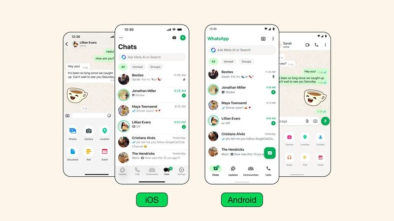
The latest WhatsApp update gets a refreshing new look with a neutral tonal palette. It overtakes platforms on iOS and Android services with a focus on improving the experience. This approach ensures that it is more user-friendly and inviting.
Although the color palette is the. the main update, the app also uses more hues of green throughout as a personal branding touch. It is applied to certain buttons and other notification badges. The design team achieved this after 35 different color options to “ultimately align with WhatsApp’s iconic green and opting for a palette that allows for harmonious color pairings throughout the app," notes the team. The neutral colors also allow the green to stand out more especially when it is in dark mode.
Image Credit: Design at Meta
Why This Trend Is Growing
- Neutral Tonal Palettes
- Exploring the use of neutral tones to create a calming and inviting messaging app interface.
- Personal Branding Touch
- Incorporating brand colors as design elements to enhance user recognition and brand connection within messaging platforms.
- Harmonious Color Pairings
- Optimizing color combinations for improved visual appeal and cohesive design in messaging app platforms.
Industries Being Reshaped
- Communication Technology
- Adopting neutral color schemes and personalized design elements to enhance user experience in messaging apps.
- Graphic Design
- Expanding design possibilities by focusing on harmonious color pairings and brand identity integration in digital platforms.
- Mobile App Development
- Leveraging the use of subtle tones and personalized touches to elevate user engagement and interface aesthetics in messaging applications.