
English art director and graphic designer Peter Saville created a modern packaging design for a newly released Switch House beer that's from Fourpure Brewing Co.
The look of the cans is sleek and contemporary, with Peter Saville incorporating vibrant geometric designs that wrap around the bottom of the products. The shapes extend up the top of the cans as well, however the majority of the modern packaging design is taken over by a simple silver color.
The cans hold a pale ale and were made to fit the aesthetic of Tate Modern -- an art gallery that's located in London, England. Peter Saville's collaborators for the project, Tate Design Studio, described the design by saying "We wanted to celebrate the simple materiality of the can and make a gesture that alludes to how the architecture of Switch House meets the raw brick of the original power station."
Why This Trend Is Growing
- Geometric Packaging Design
- Opportunities exist to incorporate geometric designs into the branding of different products, creating sleek and contemporary packaging.
- Art-inspired Beer Branding
- There is potential to partner with artists and art galleries to create limited edition beer packaging that appeals to a modern and design-savvy consumer.
- Innovative Pale Ale Marketing
- New and unconventional marketing techniques, such as collaborating with art galleries, can be used to bring attention to a specific beer and attract a younger, millennial audience.
Industries Being Reshaped
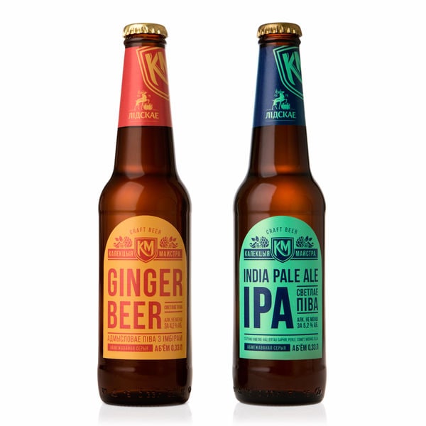
- Craft Beer Industry
- Craft beer companies can use unique, modern packaging design that appeals to younger, design-conscious consumers.
- Art and Design Industry
- Art galleries and graphic designers have the opportunity to collaborate with breweries to create limited edition beer packaging that showcases the intersectionality of art and alcohol marketing.
- Marketing and Advertising Industry
- Innovative marketing techniques, such as partnering with art galleries and collaborating with designers, can be used to promote a product and reach a new target audience.