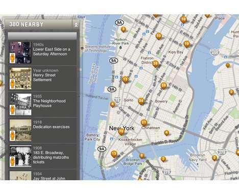
Interactive visualization and information aesthetics help to explain complex events and ideas, and the 'Map Your Moves' project challenges interested parties to create a visually representative distillation of over 4,000 moves made by some 1,700 New Yorkers.
The basis of information comes from an informal survey and challenge issued by New York-based public radio station WNYC. A number of entries were made to the 'Map Your Moves' challenge, which closed August 22, 2010.
Implications - This interactive mapping experience is perfect for the statistician, mapper or graphic designer. The raw data is available until August 22nd to be interpreted and presented in whichever way you see fit!
What's Driving This Trend
- Interactive Visualization
- Opportunity for businesses to develop interactive visualization tools that can help explain complex events and ideas.
- Information Aesthetics
- Potential for businesses to utilize information aesthetics in presenting data in visually appealing and meaningful ways.
- Data Interpretation
- Growing demand for businesses that can interpret and analyze raw data to extract valuable insights and trends.
Who This Affects Most
- Statistics and Analytics
- Statistics and analytics industry can leverage the demand for interpreting and analyzing raw data to extract insights.
- Mapping and GIS
- Mapping and Geographic Information System (GIS) industries can develop innovative tools for interactive visualization and mapping.
- Graphic Design
- Graphic design industry can explore opportunities in presenting data in visually appealing and aesthetically pleasing ways.