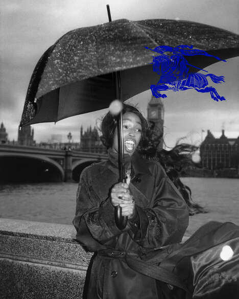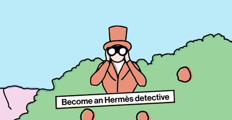
Luxury logos like Chanel's and Hermes' may seem like simple designs, but the logos were intricately made so that they would coincide perfectly with their company's luxury image. Jenna Giles, a writer for Round Peg, recently experimented with logos to prove the kind of impact they actually have on the consumer.
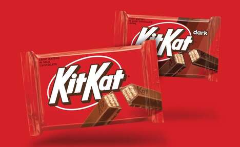
Giles swapped the colors and typography of well-known logos with famous fashion labels. For example, she deliberately switched the aesthetics of two companies that couldn't be any more opposite: Hermes and Dunkin' Donuts. The two logos are cringe-worthy to look at; Hermes no longer looks like a luxury label and the Dunkin' Donuts logo just looks down-right awkward.
Visual identity clearly plays a huge part in branding and I doubt you will see Chanel switching over to a logo that resembles Fisher Price's after seeing these examples.
What Makes This Trend Stand Out
- Simplified Logos
- There is an opportunity for brands to experiment with simplified logos to challenge traditional luxury branding.
- Visual Identity in Branding
- The impact of visual identity on consumer perception can lead to innovative approaches in logo design.
- Logo Contrasts
- Exploring logo contrasts can highlight the importance of maintaining a cohesive brand image.
Sectors Adopting This
- Fashion
- The fashion industry can explore innovative logo design techniques to enhance brand perception.
- Consumer Goods
- Consumer goods companies can rethink their logos to mirror different brand values and target new markets.
- Marketing and Advertising
- Marketing and advertising industries can leverage the impact of visual identity by offering logo redesign and creative services.