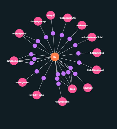
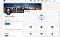
There are many great aspects to having a LinkedIn profile, but should you desire a more visual experience with the social website, feast your eyes on the newly released LinkedIn 'InMaps.' The visualized map showcases all your connections and enables the user to customize the colors through the provided legend.
Be it either a work-related connection, academic or purely social, 'InMaps' can facilitate all your connections easily. The only stipulation for LinkedIn 'InMaps' is the necessity for at least 50 connections. So gather all your friends and check out the link to see how you can do yours today!
What Makes This Trend Stand Out
- Visual Networking
- Opportunity for social media networks to create visual maps of users' connections to improve the user experience
- Customizable Data Visualization
- Opportunity for data visualization platforms to offer customization options for users to enhance their experience
- Personalized Analytics
- Opportunity for analytics companies to offer personalized analytics to individuals to help them better understand their online networks
Sectors Adopting This
- Social Media
- Social media platforms can incorporate visual networking to enhance user engagement
- Data Visualization
- Data visualization platforms can offer customizable maps of users' connections to improve user experience
- Analytics
- Analytics companies can offer personalized analytics to individual users to help them gain insights into their connections