Have you ever wondered if the subject you’re majoring at college has any real employment potential or job satisfaction in today’s industry? The ‘Wheel o’ Happiness’ infographic by collegedegrees.com illustratively categorizes every possible college major alongside its calculated job satisfaction rate.
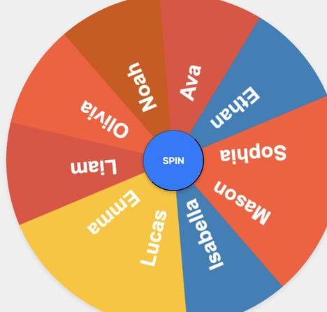
The ‘Wheel o’ Happiness’ infographic is creatively designed to look like a technicolor fortune teller’s wheel. College students can move the blue tab to their subject major and see the percentage of people in that specific field of study who are happy with their jobs after they’ve graduated college. Did you know that engineering has the highest job satisfaction rate coming in at 90%?
The ‘Wheel o’ Happiness’ is both an interactive and an educational life-planning tool.
Key Themes Behind This Trend
- Job Satisfaction Analysis
- Explore infographics and tools that analyze job satisfaction rates based on college majors.
- Interactive Career Planning
- Discover interactive tools and resources to help college students plan their future careers based on job satisfaction rates.
- Data-driven Career Insights
- Access data-driven insights and visualizations to understand the employment potential and job satisfaction of different college majors.
Where This Applies
- Education Technology
- Opportunity to develop interactive career planning tools and platforms for educational institutions.
- Market Research
- Opportunity to provide data analysis and insights on job satisfaction across various industries based on college majors.
- Human Resources
- Opportunity to utilize job satisfaction data and insights to develop employee engagement and retention strategies.