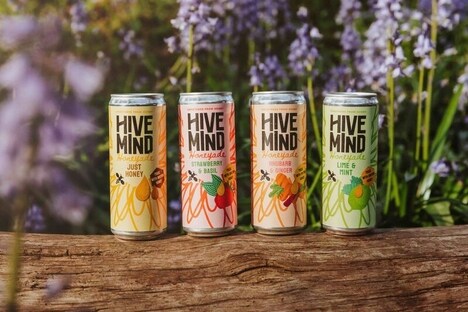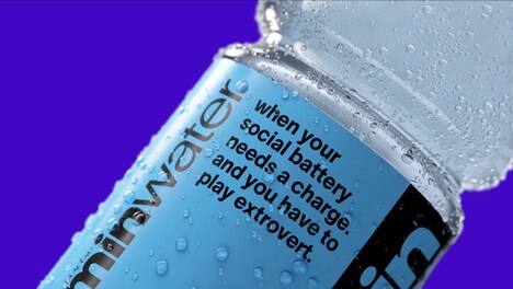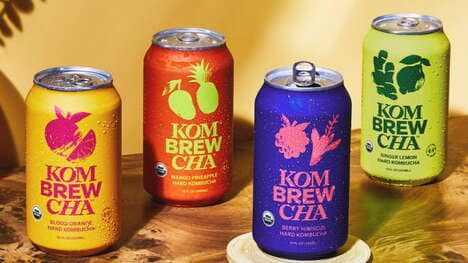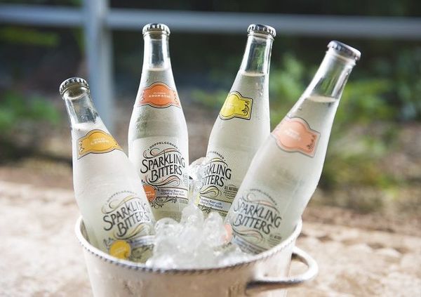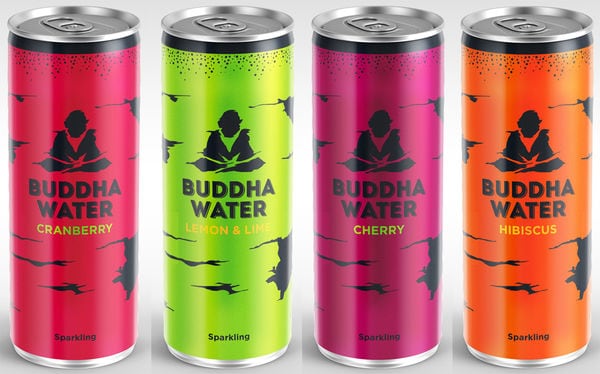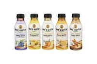
Just Bee is a brand that offers a series of delicious, natural beverages that are purported to be rich in natural antioxidants and other benefits, and the Just Bee Honey Water branding has been updated to reflect the brands growing presence.
Developed by the B&B studio creative agency, the new packaging for Just Bee beverages focuses on a rather geometrical aesthetic and helps revamp the brand to be more contemporary. The natural, raw aesthetic of the brand's previous branding helped convey the time-honored nature of the ingredients, but the brand was looking to revamp and refresh the lineup.
The Just Bee Honey Water packaging is vibrant and colorful with the color of the bees on the front corresponding to the natural ingredients kept within.
Why This Trend Is Growing
- Geometric Branding
- More companies will opt for geometrical branding designs to update and refresh their branding.
- Natural Products
- Natural, healthy and antioxidant-rich beverages are increasing in popularity, leading to more companies offering similar products.
- Recyclable Packaging
- Brands are prioritizing using environmentally-friendly packaging to meet consumer demands.
Industries Being Reshaped
- Beverages
- Beverage companies can expand their product lines by offering natural, healthy and antioxidant-rich products with geometric packaging designs.
- Graphic Design
- Graphic design agencies can specialize in offering geometrical branding designs for companies looking to update their branding.
- Packaging
- Packaging companies can innovate by creating eco-friendly and recyclable packaging solutions for brands looking to reduce their environmental impact.