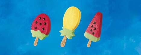
The absolutely delicious Freeze Ice Lollies branding strategy is enough to tempt the consumer into eating paper and plastic. Designer Rachel Brooks of Liverpool strove to celebrate the delightful colors and patterns of the delectable edibles and turned these images into the symbols of the brand.
This range of flavorful frozen desserts includes quite the variety in terms of shape and spectrum. You've got twisted pops and striped ice blocks that would even make an adult's eyes light up. The simplified impression of each was cartooned in marvelously bright hues and featured on the front of the individual popsicle sachets. A collection of business cards display a single sweet snack each, and a spectacular grid of the illustrated ice pops makes for a scrumptious poster design.
What's Driving This Trend
- Colorful Branding
- Creating packaging and branding that celebrates vibrant colors and patterns can be a disruptive innovation opportunity for food and beverage companies.
- Cartoon Illustrations
- Using simplified and brightly colored cartoon illustrations on packaging can make products more visually appealing and capture consumer attention.
- Product Variety
- Offering a wide range of shapes and flavors in frozen desserts can attract customers and differentiate a brand in the competitive market.
Who This Affects Most
- Food and Beverage Packaging
- Innovative packaging designs that showcase the aesthetics of food products can drive consumer interest and sales in the food and beverage industry.
- Graphic Design
- The use of captivating cartoon illustrations can create a competitive edge for graphic design companies, particularly in the packaging and branding sectors.
- Frozen Desserts
- Continuously introducing new shapes, flavors, and creative packaging in the frozen desserts industry can disrupt the market and attract consumer attention.