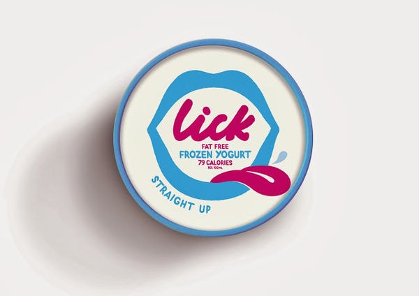
Realistic renditions of products on their boxes is a popular labeling practice, although Falcon Enamelware packaging takes a slightly different approach by simplifying the image of its minimal appearance even more to illustrate a lovely visual charm.
The iconic line of plates, bowls, platters and baking dishes is well recognized as each piece embodies a soft sculptural quality with the familiar blue rim painted around the bright white ceramic. There is a quiet sophistication to the look of the crockery that the Morse Studio team smartly decided to emphasize.
The designers took this picture of a white round-cornered rectangle with a classic blue outline, essentially the appearance of the pie dish from above. They applied this image to the top of the cardboard Falcon Enamelware packaging to communicate a timeless modest magnificence.
Key Themes Behind This Trend
- Minimal Branding
- Simplifying product images to showcase a minimalist design aesthetic creates a visually appealing packaging trend.
- Soft Sculptural Quality
- Emphasizing the soft sculptural quality of products through packaging design taps into the trend of celebrating organic and natural forms.
- Timeless Magnificence
- Communicating a sense of timeless elegance and sophistication through packaging design provides an opportunity for luxury branding.
Where This Applies
- Home Decor
- The minimalist branding trend in packaging design can be applied to home decor products, creating a modern and chic appeal.
- Kitchenware
- Highlighting the soft sculptural quality of kitchenware through packaging design opens disruptive innovation opportunities in the kitchenware industry.
- Luxury Goods
- Using packaging design to convey timeless magnificence allows luxury goods brands to stand out and create an exclusive appeal in the market.